> ## Documentation Index
> Fetch the complete documentation index at: https://docs.casebender.com/llms.txt
> Use this file to discover all available pages before exploring further.
# Branding
> Customize the look and feel of your CaseBender instance with your organization's branding elements.
## Overview
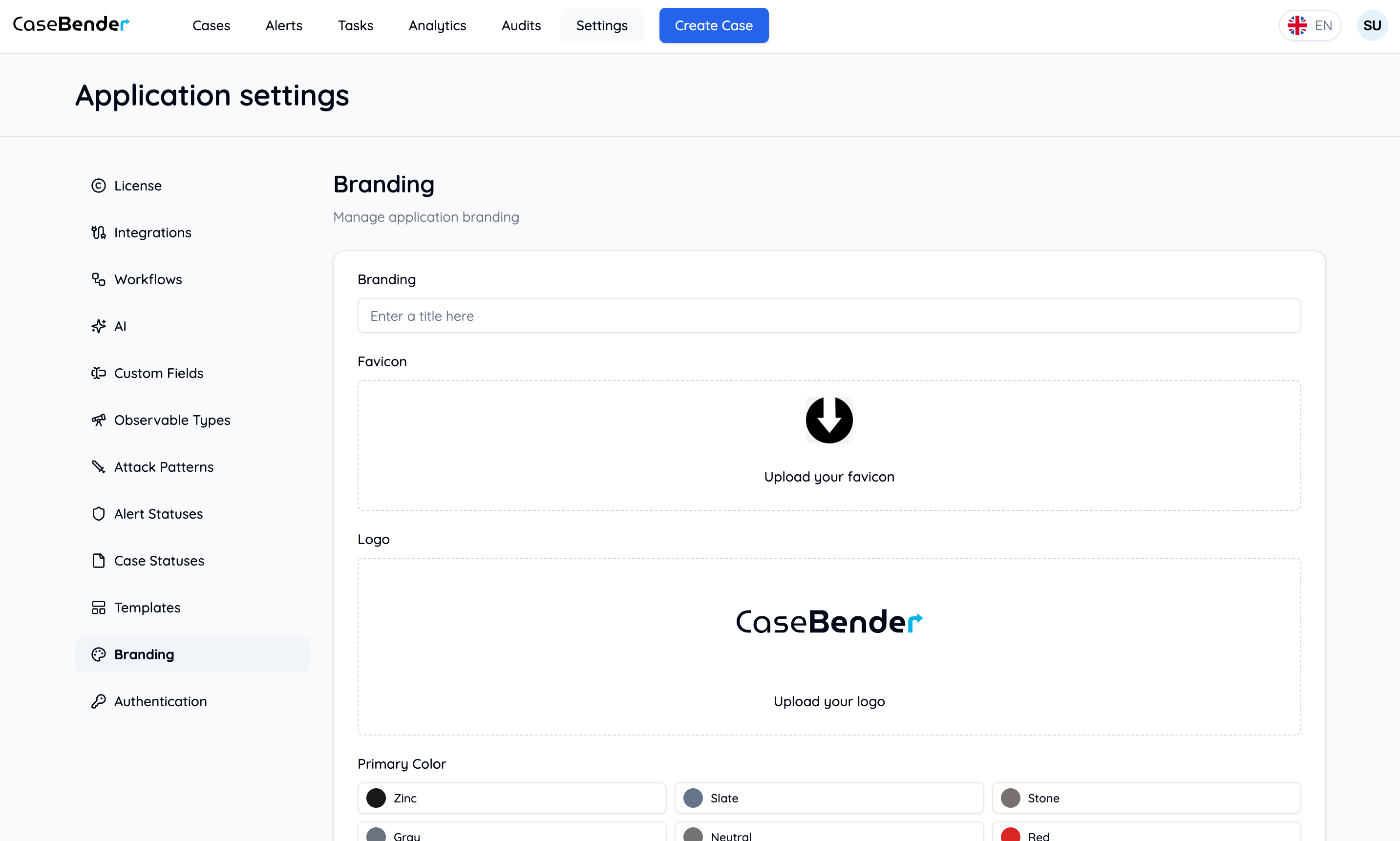
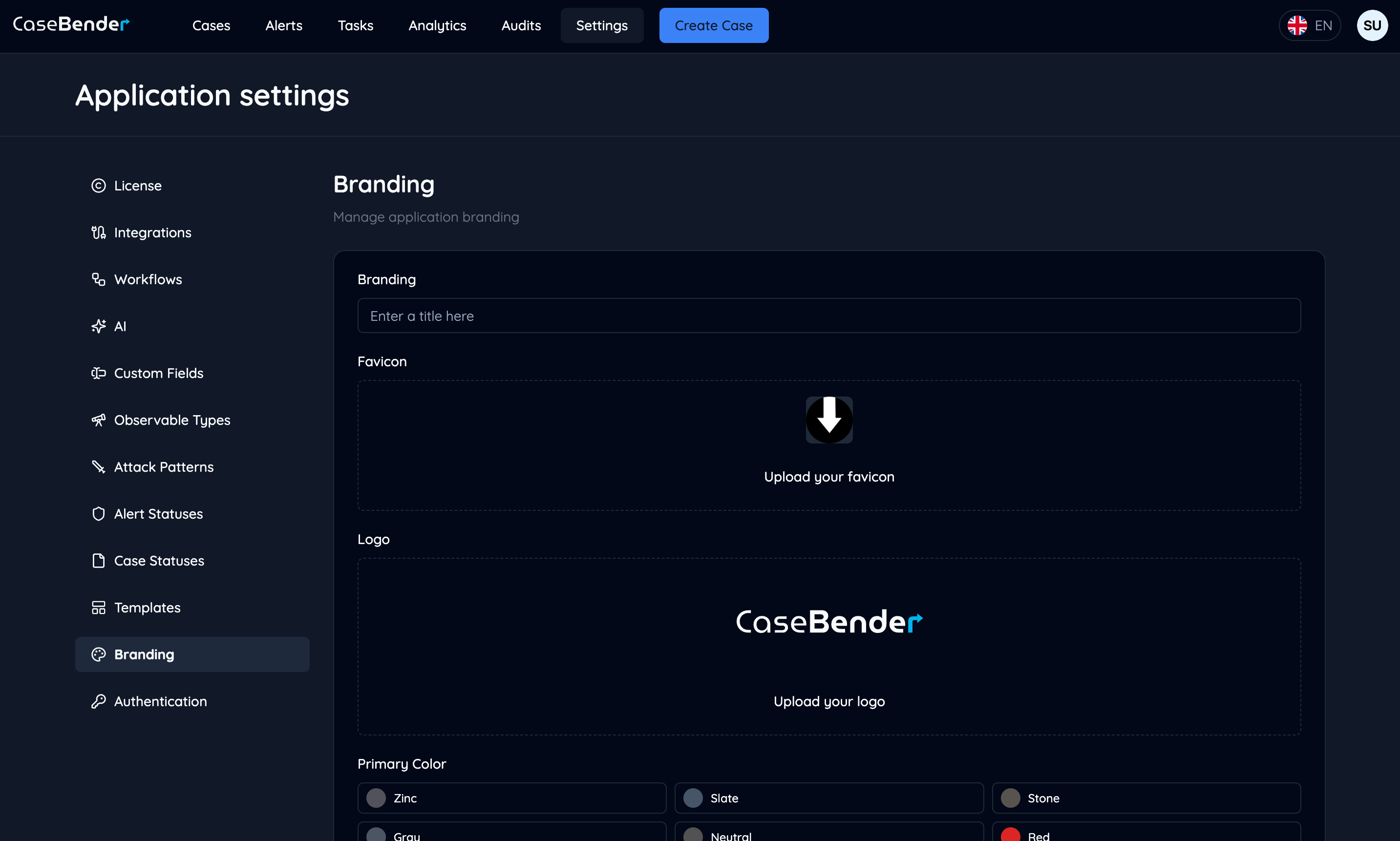
The Branding section allows you to customize the visual appearance of your CaseBender instance to match your organization's brand identity. You can configure colors, logos, and other visual elements to create a consistent and professional look across your security operations platform.
 ## Brand Elements
### Primary Colors
Configure your organization's primary color scheme:
## Brand Elements
### Primary Colors
Configure your organization's primary color scheme:
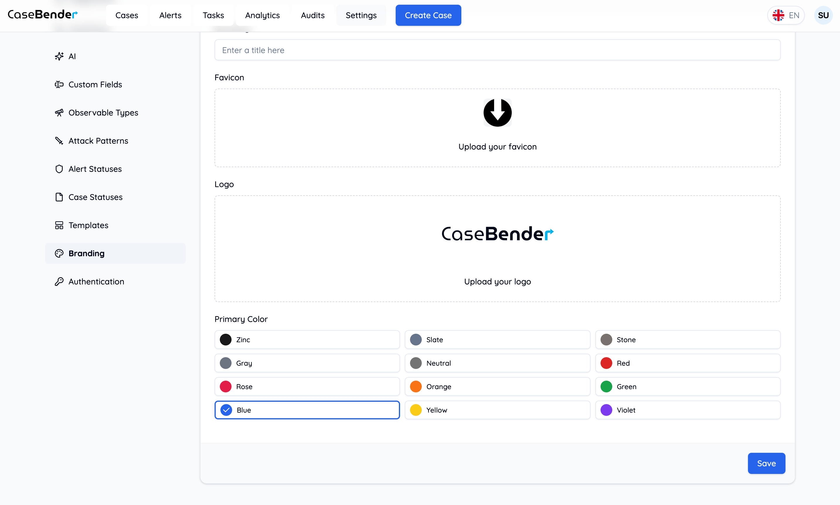
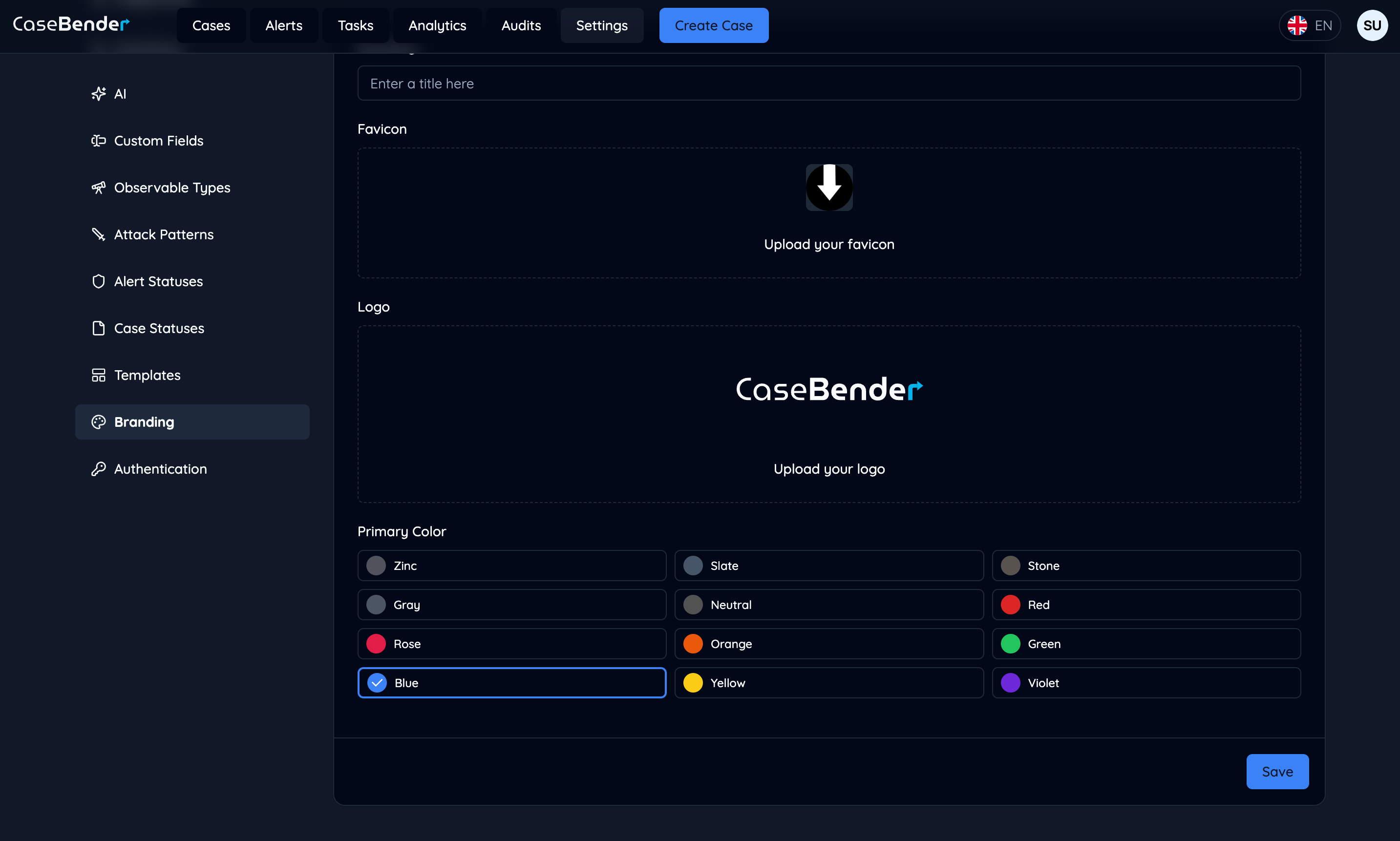 Customize the following color elements:
* Primary brand color
* Secondary colors
* Accent colors
* Background colors
* Text colors
## Customization Options
### Logo Settings
* Upload organization logo
* Set logo dimensions
* Configure placement
* Define visibility rules
* Dark/light mode variants
### Color Scheme
* Primary colors
* Secondary palette
* System status colors
* Alert level indicators
* Background gradients
### Typography
* Font family selection
* Text sizes
* Font weights
* Line heights
* Letter spacing
### UI Elements
* Button styles
* Form elements
* Card designs
* Navigation items
* Modal windows
## Theme Configuration
### Light Mode
* Background colors
* Text colors
* UI element colors
* Contrast settings
* Accessibility options
### Dark Mode
* Dark theme colors
* Text visibility
* Element contrast
* Shadow effects
* Accent highlights
### System Elements
* Navigation bar
* Sidebar
* Headers
* Footers
* Action buttons
## Best Practices
### Brand Consistency
* Follow brand guidelines
* Maintain color harmony
* Ensure readability
* Consider accessibility
* Test across devices
### Visual Hierarchy
* Emphasize important elements
* Create clear contrast
* Use consistent spacing
* Implement proper scaling
* Maintain balance
### Accessibility
* Color contrast ratios
* Text readability
* Screen reader support
* Keyboard navigation
* Focus indicators
### Performance
* Optimize image sizes
* Minimize CSS
* Cache resources
* Load time considerations
* Responsive design
## Implementation Guide
### Basic Setup
1. Upload brand assets
2. Configure primary colors
3. Set typography
4. Adjust UI elements
5. Test appearance
### Advanced Configuration
1. Custom CSS rules
2. Component overrides
3. Theme variations
4. Responsive adjustments
5. Animation settings
### Testing
1. Cross-browser testing
2. Device compatibility
3. Accessibility validation
4. Performance checks
5. User feedback
Customize the following color elements:
* Primary brand color
* Secondary colors
* Accent colors
* Background colors
* Text colors
## Customization Options
### Logo Settings
* Upload organization logo
* Set logo dimensions
* Configure placement
* Define visibility rules
* Dark/light mode variants
### Color Scheme
* Primary colors
* Secondary palette
* System status colors
* Alert level indicators
* Background gradients
### Typography
* Font family selection
* Text sizes
* Font weights
* Line heights
* Letter spacing
### UI Elements
* Button styles
* Form elements
* Card designs
* Navigation items
* Modal windows
## Theme Configuration
### Light Mode
* Background colors
* Text colors
* UI element colors
* Contrast settings
* Accessibility options
### Dark Mode
* Dark theme colors
* Text visibility
* Element contrast
* Shadow effects
* Accent highlights
### System Elements
* Navigation bar
* Sidebar
* Headers
* Footers
* Action buttons
## Best Practices
### Brand Consistency
* Follow brand guidelines
* Maintain color harmony
* Ensure readability
* Consider accessibility
* Test across devices
### Visual Hierarchy
* Emphasize important elements
* Create clear contrast
* Use consistent spacing
* Implement proper scaling
* Maintain balance
### Accessibility
* Color contrast ratios
* Text readability
* Screen reader support
* Keyboard navigation
* Focus indicators
### Performance
* Optimize image sizes
* Minimize CSS
* Cache resources
* Load time considerations
* Responsive design
## Implementation Guide
### Basic Setup
1. Upload brand assets
2. Configure primary colors
3. Set typography
4. Adjust UI elements
5. Test appearance
### Advanced Configuration
1. Custom CSS rules
2. Component overrides
3. Theme variations
4. Responsive adjustments
5. Animation settings
### Testing
1. Cross-browser testing
2. Device compatibility
3. Accessibility validation
4. Performance checks
5. User feedback